At its core, a wound assessment chart is a standardized, systematic tool. It’s what clinicians across all care settings use to objectively document a wound’s characteristics and how it's healing—or not healing—over time. These charts help us move beyond vague, subjective notes like "looks better," creating a shared, data-driven language for the entire multidisciplinary care team. This is not merely paperwork; it is a critical component of patient care, legal protection, and financial viability for any healthcare organization.
This common ground is essential for tracking nuanced changes, guiding evidence-based treatment decisions, and ultimately, justifying the care we provide. Without it, care becomes fragmented, inconsistent, and difficult to defend during audits. A well-structured chart transforms an art into a science, ensuring every patient receives the highest standard of care based on clear, quantifiable data.
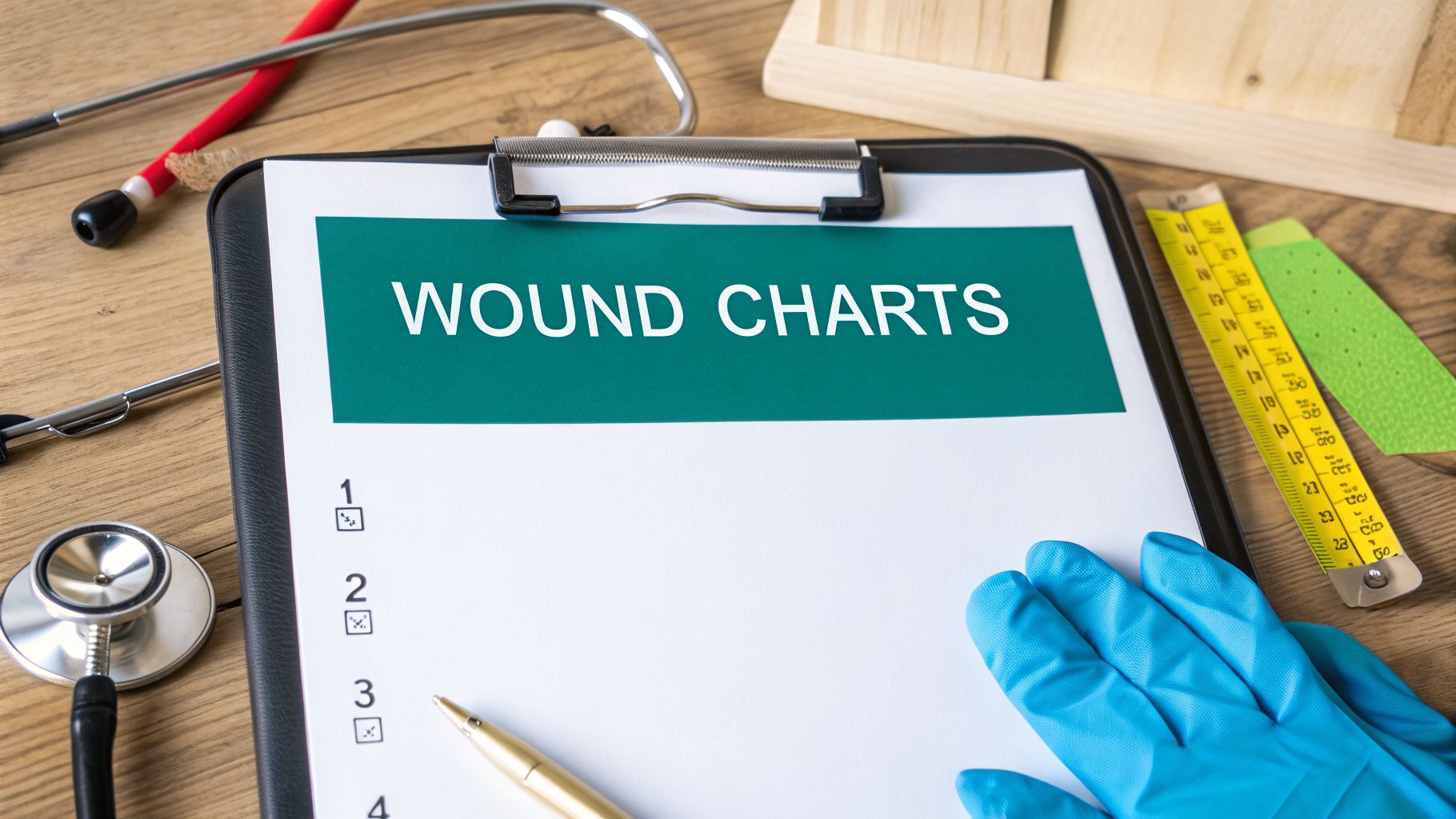
Why Accurate Wound Charts Are Your Clinical North Star

Let's be honest. After a long and demanding shift, documentation can feel like just another box to check off a never-ending to-do list. But what if we saw it differently? A well-designed wound assessment chart isn't a burden; it's arguably our most powerful clinical tool. Think of it as your North Star for navigating the complexities of patient care, providing direction, and ensuring you are always on the right path toward healing.
In my years of clinical experience, these charts are the absolute foundation of effective wound management. They are the mechanism that turns subjective guesswork into objective science. Without a standardized framework, care gets dangerously fragmented, and we end up relying on inconsistent, often unhelpful descriptions that change from one clinician to the next.
Imagine a home health nurse noting a patient's pressure injury as "looking a little worse." A week later, another nurse from the same agency writes it's "more red." Neither of those notes gives us actionable data. This kind of imprecision can lead to dangerous delays in spotting a burgeoning infection, escalating care when necessary, or switching up a treatment plan that just isn't working. It creates gaps in the patient's story that can have serious clinical consequences.
From Subjective Notes to Objective Science
This is precisely where established frameworks like the TIME model (Tissue, Infection/Inflammation, Moisture, Edge) really shine. By systematically documenting each of these core components, we create a clear, repeatable, and defensible process. Suddenly, everyone on the team—from the physician in the outpatient clinic to the nurse on a home visit and the physical therapist in the hospital—is speaking the same clinical language.
This monumental shift from subjective, narrative notes to quantifiable, standardized tools didn’t happen overnight. The journey really began back in 1975 with Shea's pressure ulcer staging system, a foundational step that was later improved by more dynamic tools like the Pressure Ulcer Scale for Healing (PUSH). By 2002, the TIME acronym was formally introduced, turning assessment into the cyclical, evidence-based process we know and rely on today.
For modern wound care clinics and home health agencies, implementing these standardized charts can slash documentation errors and inconsistencies by up to 70%. This efficiency leads directly to faster, more reliable reimbursements and, most importantly, demonstrably better patient outcomes. If you're interested, you can dive deeper into the historical progression of these essential tools and their impact on modern wound care.
A wound chart is more than a record; it’s a story of healing told with data. When every clinician contributes a clear, consistent chapter, the plot becomes easy to follow, and the ending is far more likely to be a successful one.
This shared data stream empowers the entire care team to make smarter, faster, more confident decisions. During interdisciplinary hospital rounds, a clear chart lets a surgeon grasp a wound's status in mere seconds. For a home health agency, it ensures seamless continuity of care, even when different nurses are visiting the same patient on different days. It gives you the objective, unassailable evidence needed to justify advanced therapies, such as negative pressure wound therapy or cellular tissue products, or to make critical changes in the plan of care.
Protecting Your Practice and Your Patients
Beyond improving patient outcomes, rigorous, standardized documentation is a critical safeguard for your practice. Inconsistent, incomplete, or illegible notes create serious vulnerabilities from both a legal and a financial standpoint.
A detailed, standardized wound assessment chart provides a clear, chronological, and legally sound record of the care provided and the wound's response to that care. It’s your best defense when facing payer audits, regulatory scrutiny, or potential legal challenges. In a world of increasing oversight, your documentation is your testimony.
Ultimately, making wound assessment charts a central, non-negotiable part of your clinical workflow does more than just satisfy regulatory requirements. It builds and reinforces a culture of precision, accountability, and excellence. It ensures every clinical decision is backed by solid, objective data, turning every assessment into a meaningful, measurable step toward healing. This isn't just about filling out a form; it's about steering patient care with unwavering confidence and clarity.
Building a High-Impact Wound Assessment Chart

A wound assessment chart is only as good as the information you put into it. If key data points are missing, or if one nurse documents things differently than the next, the chart fails at its most important job: telling a clear, consistent story of healing. Designing a chart that actually works for your team means going beyond just checking boxes. It’s about being deliberate and evidence-based—thinking through what you measure, why you measure it, and exactly how you record it to ensure inter-rater reliability.
This quest for systematic wound care isn't new; it's a practice that's been refined for nearly 5,000 years. Ancient Egyptian records from 2200 BC describe the "three healing gestures" of washing, plastering, and bandaging. The Romans later gave us the four cardinal signs of inflammation—calor (heat), dolor (pain), rubor (redness), and tumor (swelling)—that we still look for today. This long evolution brought us to Shea's four-stage system in 1975, the game-changing TIME framework in 2002, and the sophisticated digital charts we use now.
And the stakes couldn't be higher. With pressure ulcers alone affecting 2.5 million U.S. patients annually at a staggering cost of $11 billion, great documentation is more than just a task—it's a critical clinical and financial intervention. In fact, solid, standardized charting has been shown to reduce wound incidence by 30% by catching problems early and promoting proactive care. If you're interested, you can delve into the fascinating history of wound assessment and its impact on modern care to see how these lessons from the past shape what we do today.
Essential Components of a High-Impact Wound Assessment Chart
Here’s a breakdown of the non-negotiable fields your chart must have. These components create a universal language for your team, ensuring that every clinician is collecting the same critical data, the same way, every single time. This consistency is the bedrock of reliable care.
| Chart Component | Clinical Purpose | Documentation Best Practice |
|---|---|---|
| Precise Anatomical Location | To eliminate ambiguity and accurately track multiple wounds on the same patient over time. | Avoid vague descriptions like "left leg." Instead, be specific: "Lateral aspect of the left malleolus" or "2 cm superior to the right popliteal fossa." Use anatomical landmarks for precision. |
| Wound Etiology & Classification | To identify the underlying cause (e.g., pressure, venous, arterial, diabetic), which dictates the entire plan of care. | Document the specific origin and stage/grade. For example, "Stage 2 Pressure Injury" or "Diabetic Foot Ulcer, Wagner Grade 1." This is fundamental for correct treatment and coding. |
| Standardized Measurements | To provide objective, reproducible data to track healing progression or deterioration. | Use the clock method as the gold standard. Length is always head-to-toe (12-to-6 o'clock). Width is always side-to-side (9-to-3 o'clock). Depth is measured at the deepest point using a sterile applicator. |
| Wound Bed Tissue Types (%) | To quantify debridement effectiveness and the growth of new, healthy tissue. This is vital for proving medical necessity. | Estimate and document the percentage of each tissue type present. For instance, "60% granulation, 30% slough, 10% eschar." This provides a clear snapshot of wound status. |
| Exudate (Amount & Type) | To assess moisture balance and identify potential signs of infection or other complications. | Describe both the amount (scant, minimal, moderate, large, copious) and the type (serous, serosanguineous, sanguineous, purulent). Note any odor as well. |
| Periwound Skin Condition | To evaluate the health of the surrounding skin, which is crucial for wound closure and indicates potential complications. | Note color (erythema, ecchymosis, hyperpigmentation), integrity (macerated, denuded, excoriated), and texture (indurated, boggy, edematous, fibrotic). |
| Undermining & Tunneling | To identify and measure tissue destruction beneath the wound surface, which can hide the true extent of the injury. | Document using the clock method for location and depth. For example, "3 cm of undermining from 1 o'clock to 4 o'clock" or "1.5 cm tunnel at 7 o'clock." |
| Pain Assessment | To capture the patient's subjective experience, which can signal infection, ischemia, or other complications. | Use a standardized scale (e.g., 0-10 Numeric Rating Scale, Wong-Baker FACES) and describe the character (burning, throbbing, sharp, aching) and timing of the pain (e.g., at rest, during dressing changes). |
Capturing these elements consistently turns a simple piece of paper or a digital screen into a powerful clinical tool. It provides the hard, objective data needed to justify treatment decisions, demonstrate medical necessity for reimbursement, and tell a complete, coherent story of the patient's journey.
Quantifying What You See: The Wound Bed and Periwound
Once you've nailed down the basics of location and measurement, the real art and science of documentation comes from describing the wound bed and the surrounding skin. This is where the story of healing—or the lack thereof—truly comes to life in vivid detail.
Your chart should force clinicians to move past vague, unhelpful terms like "necrotic." Instead, it needs to prompt for specifics, like "70% adherent yellow slough, 30% viable granulation tissue." This level of detail isn't just for show; it provides objective proof that your debridement strategies are working and that healthy tissue is regenerating, which is critical for justifying continued treatment.
Don't forget the periwound skin—it’s just as important as the wound itself. Its condition gives you critical clues about moisture management, the presence of bioburden, infection, and the impact of friction or shear forces.
A healthy periwound environment is the foundation for a healing wound. Ignoring signs of maceration, spreading erythema, or induration is like trying to build a house on unstable ground—the entire effort is at risk of failure.
Your chart needs dedicated fields to quickly and accurately document:
- Color: Is there any spreading erythema (redness), cyanosis (bluish discoloration), or hemosiderin staining?
- Texture: Is the skin indurated (hardened), boggy (spongy), crepitus (crackling sensation), or unusually dry and flaky?
- Integrity: Do you see any maceration (softening from too much moisture), excoriation (linear scratches), or denudation (loss of epidermis)?
Finally, always make space for what the patient is feeling. Pain is a vital—and often under-documented—metric. Capturing its intensity, its character (e.g., burning, stabbing, aching), and its triggers can reveal critical issues like deep space infection, arterial compromise, or neuropathy that you might not see with your eyes alone.
When you combine this objective data with a clear photo protocol and the patient's own words, you get a complete, 360-degree view of the wound. If you’re looking for a solid framework to get started, checking out a comprehensive wound care documentation template can provide an excellent foundation. This powerful combination of metrics, high-quality images, and patient-reported feedback is what elevates a form from a daily chore to a dynamic tool for providing exceptional, defensible care.
Making Your Wound Charts Work in the Real World

A perfectly designed wound assessment chart is just a piece of paper (or a digital screen) until it's put to the test in a real clinical environment. A chart collecting dust in a binder during a hectic shift does absolutely nothing for your patients or your practice. The real measure of its value is how it holds up in the chaos of a busy clinic, a packed hospital floor, or a patient's home.
The ultimate goal is to seamlessly weave these charts into your daily rhythm so they become an intuitive extension of your clinical practice—not just another administrative box to check. This requires thoughtful implementation and team-wide buy-in.
This all starts with getting the whole team on the same page. The keyword here is consistency. Every single clinician, from the most seasoned wound care specialist to the newly graduated nurse, has to measure, describe, and document wounds the exact same way, every time. This is how you eradicate vague, unhelpful notes like "looks a little better today" and replace them with objective, actionable data that actually means something and can guide care.
When training is standardized and reinforced, the wound documented by a night-shift nurse in the ICU provides the same high-quality, reliable data as the one assessed by a visiting home health nurse the next morning. It’s this shared language and methodology that builds a foundation for truly reliable, data-driven, and legally defensible wound care.
Tailoring a Workflow for Each Setting
Success hinges on adapting your charting process to fit the unique pressures and constraints of each care environment. A rigid, one-size-fits-all approach is doomed to fail. You need practical, battle-tested strategies that make sense for your team's day-to-day reality and don't add unnecessary friction to their workflow.
Let’s look at how this plays out in different clinical scenarios:
In Home Health: Time is the most precious commodity. The challenge is getting a thorough, accurate assessment done efficiently without falling behind schedule. With the right workflow, a nurse can complete a detailed digital wound chart in under 10 minutes. This means prepping materials ahead of time, using a tablet or mobile app for quick, point-of-care data entry, and snapping standardized photos that include a measurement guide right in the frame for scale and consistency.
On the Hospital Floor: The shift handoff is a critical juncture where information can be lost or misinterpreted. We’ve all seen how poor communication leads to medical errors. A standardized wound chart becomes your most effective communication tool. Instead of a vague verbal update, the outgoing nurse can brief the incoming one with concrete, objective data in just a few minutes. The conversation changes from "The wound on Mr. Smith's sacrum" to "Mr. Smith's Stage 3 pressure injury shows 20% more granulation tissue since yesterday's debridement, and the periwound erythema has decreased by 1 cm."
At the Outpatient Clinic: With back-to-back appointments, efficiency is the name of the game. The workflow can be streamlined by having a medical assistant prep the patient, remove the old dressing, and assemble supplies. The clinician then performs the hands-on assessment, perhaps dictating findings into a voice-enabled documentation tool like Ekagra Health AI. The chart gets filled out in real-time, which means no more staying late to finish a mountain of documentation.
The best wound assessment charts aren’t just documents; they are communication platforms. They translate complex clinical observations into a universal language that every member of the care team can understand and act upon instantly.
By fine-tuning the workflow to the specific setting, you remove the friction that makes good documentation feel like a chore. The chart becomes an ally in providing excellent care, not another administrative burden standing in the way.
Training Strategies That Actually Stick
Great training is more than a one-and-done PowerPoint session during orientation. It's a continuous, ongoing process of education, reinforcement, and competency validation. If you want your team to be perfectly aligned, you have to establish clear, non-negotiable standards from the top down.
A great first step is to officially designate an evidence-based wound assessment framework (like TIME) in your organization’s policies and procedures. This makes it official. Everyone gets trained on it and is expected to use it consistently, no matter their previous habits or training.
Here are a few training ideas that have worked for my teams and have proven effective:
- Hands-On Workshops: Invest in some lifelike wound models and have your clinicians practice measurement techniques, especially for tricky things like undermining and tunneling. This is the perfect, low-stakes setting to standardize how everyone uses the clock method and measures depth consistently.
- Photo Drills: Create a simple, one-page "photo protocol" that spells out the required lighting, distance, angle, and the absolute need for a disposable ruler in every shot for scale. Have team members practice taking photos of the models and then critique them together as a group to nail down consistency.
- Peer Audits: Set up a regular, non-punitive peer review process. Have clinicians look over each other’s charts to spot inconsistencies, identify areas for improvement, and share tips for better documentation. This builds a sense of shared ownership and professional accountability.
- Pocket Guides: Develop laminated pocket cards or a digital "cheat sheet" accessible on their phones that summarizes key definitions (like the difference between slough and eschar, or serous vs. purulent drainage) and measurement rules. It gives staff a quick, reliable reference right at the point of care.
Ultimately, bringing a wound chart to life is about building new habits and fostering a culture of precision and excellence. When the whole team speaks the same clinical language, the chart stops being a static, historical record and becomes a dynamic, predictive tool that actively helps you improve patient outcomes and protect your organization.
How Great Charting Secures Your Reimbursement
Let's talk about connecting what happens at the bedside directly to your practice's bottom line. We all know that patient care comes first, but the financial health of your clinic or agency is what keeps the doors open and the lights on. A detailed, meticulous wound assessment chart isn't just a clinical note—it's the primary evidence you submit to prove your services were medically necessary and get paid for your work.
Every single detail you record on that chart has a direct line to your revenue cycle. When you document precise measurements, note the exact percentages of different tissue types, and describe drainage with clinical specificity, you're building an undeniable, audit-proof case for medical necessity. This is the language payers, from Medicare and Medicaid to private insurers, understand and demand.
Connecting Clinical Details to CPT and ICD Codes
Think of your wound assessment chart as the source code for your billing department. The data you enter is what justifies the CPT (Current Procedural Terminology) codes for procedures and the ICD (International Classification of Diseases) codes for diagnoses on your claim. Without that granular, supporting detail in the clinical record, your claims are just numbers on a form, making them far more likely to be questioned, downcoded, or flat-out denied.
For example, if you bill for selective debridement of a wound (like CPT code 97597 for the first 20 sq cm), your documentation absolutely must show the presence and percentage of non-viable tissue like slough or eschar. A note that just says "wound debrided" leaves the door wide open for a payer to reject it for lack of sufficient evidence.
A claim without detailed, supporting documentation is an opinion. A claim backed by a comprehensive wound assessment chart is a fact. Payers reimburse facts, not opinions.
Your charting needs to paint a clear, unambiguous picture that an auditor can easily connect to the codes you’ve chosen. This includes:
- Wound Dimensions and Depth: This data supports the complexity of care and is crucial for codes related to debridement, which are often based on surface area.
- Tissue Percentages: This is the hard evidence for why debridement was medically necessary. A chart noting "70% adherent yellow slough" is infinitely stronger than a vague "necrotic tissue present."
- Undermining or Tunneling: The presence and measurement of these immediately signals a more complex wound, justifying higher levels of care and potentially different, more intensive procedural codes.
- Signs of Local or Spreading Infection: This is critical for supporting ICD-10 codes for infection and justifying antimicrobial dressings, antibiotics, or more frequent visits.
Avoiding Common Documentation Pitfalls That Trigger Denials
Most claim denials I've seen over the years come down to simple, preventable documentation failures. An auditor is looking for two things: consistency over time and detail at each visit. If they can’t quickly connect your charting to the services you billed, they won't hesitate to deny the claim, forcing you into a time-consuming appeals process.
The good news is these mistakes are almost always preventable with a standardized charting process and robust training. Good documentation habits here directly protect your revenue by creating an audit-proof record of care from day one.
Here’s a classic real-world scenario: a home health agency submits claims for frequent skilled nursing visits for a patient with a venous leg ulcer. The daily notes are vague, often just stating "dressing changed, wound healing." The payer denies the claim, citing a lack of medical necessity for the visit frequency.
A much stronger, defensible approach would be a chart detailing weekly measurements showing a stalled wound, objective descriptions like "copious serosanguineous drainage requiring daily dressing changes," and signs of periwound maceration. That objective data proves the wound requires skilled management and justifies the number of visits, making the claim far more likely to be paid without question.
The Financial Impact of Meticulous Charting
The link between documentation quality and financial stability is direct and powerful. Chronic wounds affect an estimated 6.5 million patients in the U.S. every year, costing the healthcare system over $25 billion. For outpatient wound care centers and podiatry groups where margins can be tight, precise, efficient documentation isn't just good practice—it's a core survival strategy.
When you map CPT and ICD codes directly from a comprehensive wound assessment chart, you can see up to 90% of claims paid on the first submission, significantly improving your clean claim rate and cash flow. Without this level of detail, documentation gaps contribute not only to delayed healing for the patient but also to significant, preventable revenue loss for the organization. As others have noted, the evolution of wound care has shown a clear line between detailed records and better outcomes, both clinical and financial. You can discover more insights about the evolution of wound care documentation and its financial impact from industry experts.
Ultimately, every word and number you put on that chart is working to protect your revenue. It turns your clinical expertise into a clear, justifiable record that ensures you are paid correctly and promptly for the essential, life-changing care you provide. You can also dive deeper by exploring our guide on mastering Medicare billing units to further strengthen your reimbursement strategy.
The Next Frontier in Wound Documentation is AI
What if you could finish a complete, detailed, and billable wound assessment without ever fumbling with a paper ruler or typing a single note into a clunky EMR? This isn't a glimpse into some far-off future. It's what Artificial Intelligence is making possible in wound care documentation right now. For years, we've wrestled with the manual charting process—it’s clunky, time-consuming, prone to human error, and a major source of clinician burnout. Technology is finally giving us a better way.
The real struggle has always been capturing complex clinical observations quickly and correctly while you're at the bedside with the patient. AI-powered platforms are built to solve this exact problem, completely changing how we approach wound assessment charts and freeing up clinicians to focus on patient care.
Voice-Powered Documentation in Real Time
One of the biggest game-changers is voice-powered, ambient clinical documentation. You can now perform a hands-on assessment and simply speak your findings aloud in natural language, just like you’re dictating to a colleague or a scribe.
Instead of stopping to type, you can just describe what you see as you see it. You might say, "The wound on the left lateral malleolus is four-point-five by three-point-two centimeters. I'm seeing one-point-one centimeters of undermining from 1 o'clock to 3 o'clock. The wound bed looks like it’s about 60% granulation and 40% yellow slough. There is moderate serosanguineous drainage and the periwound skin is macerated."
In the background, a sophisticated AI engine isn't just transcribing your words—it's understanding the clinical context and structuring them. The system instantly populates the correct fields on the digital chart with the precise, structured data. This simple but profound shift all but eliminates after-hours charting and slashes the risk of transcription errors that inevitably happen when you’re documenting from memory long after the visit.
Automating Measurements and Tissue Analysis with AI
The next layer of innovation is AI-driven image analysis. Let's be honest, even with the best technique and training, manual wound measurement has inherent variability. Two highly skilled clinicians could measure the same wound and get slightly different numbers, which can throw off healing trend data and make it harder to assess treatment efficacy over time.
AI takes that guesswork and subjectivity out of the equation. Just by taking a quick photo with a smartphone or tablet, the software can:
- Automate Measurements: An algorithm instantly calculates the length, width, surface area, and perimeter with incredible, superhuman precision and consistency.
- Analyze Tissue Types: It can differentiate between granulation, slough, and eschar, automatically calculating the percentage of each tissue type present in the wound bed, removing subjective estimation.
- Track Progress Visually: The system can overlay images from different visits, creating a visual timeline that makes even subtle changes in size or tissue composition impossible to miss.
This is what that kind of AI-powered interface actually looks like—it brings all that visual data and structured analysis together in one intuitive dashboard.

You can see how AI tools present complex wound data in a clear, visual format, making it far easier and faster to assess healing trends at a glance.
The real power of AI in wound care isn't about replacing clinicians. It’s about augmenting our expertise, getting rid of the administrative headaches that cause burnout, and giving us back precious time to focus on what actually matters—our patients.
AI-powered documentation finally gives us the tools we need to be both highly efficient and meticulously accurate. Platforms like Ekagra Health AI are designed to capture notes right there during the patient visit and immediately turn them into structured, billable data that integrates with your EHR. The technology handles the tedious, repetitive stuff, so you can stay fully present with the patient.
If you’re wondering how this all fits into daily practice, a great next step is to explore the different wound assessment tools for nurses and other clinicians. It’s a paradigm shift that helps us practice at the top of our license, making data-driven decisions faster and with more confidence than ever before.
Your Top Questions About Wound Assessment Charts, Answered
When it comes to the day-to-day work of wound documentation, a lot of the same practical questions pop up time and again. Let's tackle some of the most common ones I hear from clinicians, administrators, and billers in the field.
How Often Should I Document a Wound Assessment?
There's no single magic number here—it really depends on the wound type, the care setting, the patient's overall condition, and your facility's own policies. But a great rule of thumb is to always perform a full, comprehensive assessment the moment you discover a wound or when the patient is first admitted to your service. This establishes the critical baseline.
For chronic wounds in an outpatient or home health setting, a detailed weekly assessment has become the standard of care. This gives you a good, consistent rhythm for tracking progress and justifying continued care without creating an unnecessary paperwork burden. Of course, if you see any significant change in the wound—for better or worse—you need to document it right away, regardless of the schedule. For acute, complex, or high-risk wounds in an inpatient setting? You might be looking at daily or even per-shift assessments.
It's not just about how often you document, but how consistently you do it. Regular, scheduled charting is what builds a clear, reliable, and legally defensible story of the healing process—and that's gold for both clinical decisions and getting paid.
What Are the Biggest Mistakes to Avoid in Wound Charting?
I see a lot of charting errors, and most of them trace back to one root cause: a lack of standardization. The single biggest and most common mistake is inconsistent measurement technique. If one nurse measures a wound one way (e.g., longest length by widest width) and the next does it differently, your data is compromised and essentially useless for tracking progress. Everyone on the team must use the clock method (12-to-6 for length, 9-to-3 for width) every single time. No exceptions.
Another major pitfall is using vague, subjective, or non-clinical terms. Don't just write "necrotic" or "looks infected." Get specific. Documenting "70% adherent yellow slough, 30% black eschar" is far more powerful and defensible in an audit than a generic term. Similarly, instead of "looks infected," describe the objective signs: "+2 rubor extending 3 cm from wound edge, purulent drainage, and malodorous." Also, don't forget the periwound skin! Its condition gives you so many clues about what's going on with moisture, pressure, and potential infection.
Finally, a bad photo is almost as bad as no photo. If it's blurry, poorly lit, taken from an inconsistent angle, or doesn't have a measurement guide for scale, it's impossible to track progress accurately. The fix for all of this? Get your team trained on a single, standardized process and do occasional peer audits to keep everyone sharp and on the same page.
Can Digital Wound Charts Integrate with Our Existing EHR?
Yes, and honestly, they absolutely have to. In today's interconnected healthcare ecosystem, this is a non-negotiable feature for any modern wound documentation platform. The best digital tools, including advanced platforms like Ekagra Health AI, are built from the ground up using modern APIs to integrate seamlessly with major Electronic Health Record (EHR) systems like Epic, Cerner, PointClickCare, and others.
Think of seamless, bidirectional integration as a must-have, not a nice-to-have. It stops the soul-crushing, error-prone work of double-documenting—entering data in the wound care app and then again in the main EHR. More importantly, it puts the most current, detailed wound data right where the entire care team can see it, within the patient's primary chart—the system they already know and use. It breaks down those frustrating information silos between departments and leads to much better, safer, and more coordinated care.
My advice? Before you sign on with any new wound documentation platform, get definitive proof of its integration capabilities with your specific EHR. Ask for a live demonstration. It will save you a world of headaches, frustration, and wasted time down the road.
Ready to stop wrestling with manual charting and cut your documentation time by up to 70%? Ekagra Health AI uses voice commands and smart AI analysis to build perfect, audit-proof wound charts in minutes, not hours.
